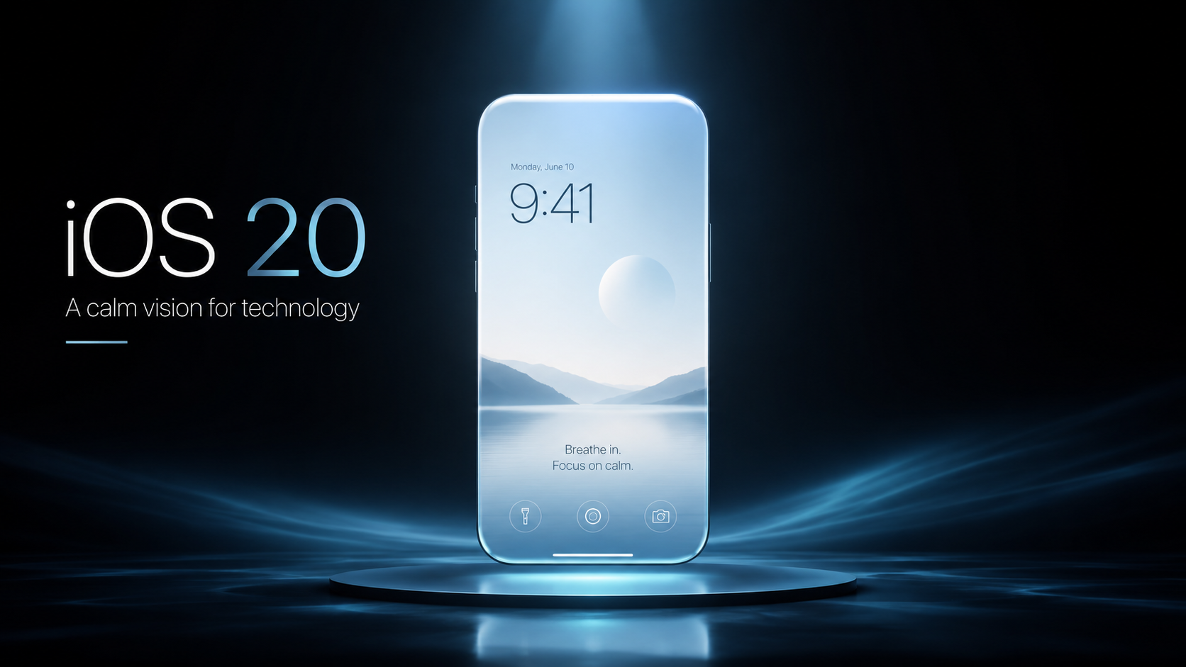
iOS 20
A Personal Design Reflection by Maikel van Esdonk
Not a product proposal. A reflection on simplicity, clarity and the emotional side of technology.
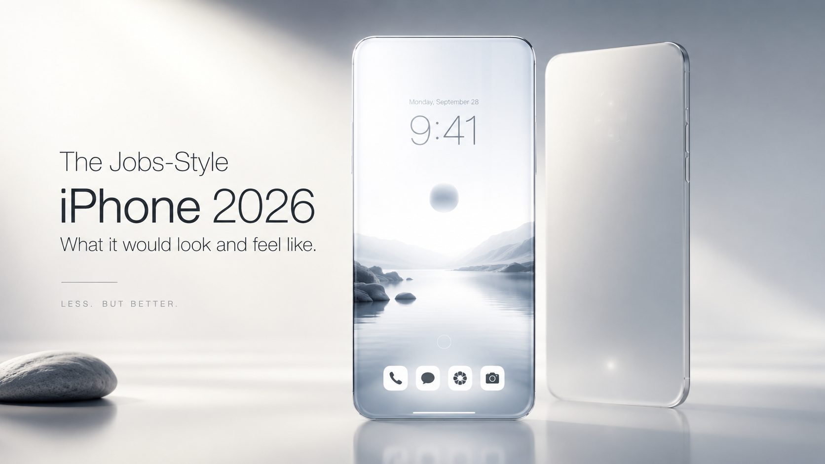
1. A single, uninterrupted slab of glass
Jobs hated visual noise. This iPhone would be:
- perfectly symmetrical
- no camera bump
- no visible seams
- no ports
- no logos on the front or back
Just a pure, calm object — like a polished river stone.
2. A return to the “one button” philosophy
Jobs believed one button was enough. This iPhone would have:
- a single, haptic Home Button (flush, invisible until touched)
- no Action Button
- no volume buttons (gesture‑based volume instead)
The device becomes simpler, not busier.
3. A Zen‑inspired interface
Jobs’ UI philosophy was about clarity and emotional calm.
- fewer icons
- more white space
- no cluttered widgets
- typography‑first design
- animations that feel like breathing
The phone feels like a tool for the mind, not a dashboard.
🧘♂️ What Jobs would change about modern iPhones
1. Reduce feature creep
Jobs would cut:
- redundant camera modes
- endless settings
- notification overload
- unnecessary apps
He’d ask: “What can we remove?” Not: “What can we add?”
2. Re‑center the device around intuition
Jobs trusted taste over data. This iPhone would:
- anticipate actions
- hide complexity
- feel “alive” without being busy
Think of it as the opposite of feature‑heavy Android phones.
3. Make the camera invisible
Jobs hated protrusions. A Jobs‑style 2026 iPhone would use:
- under‑glass lenses
- computational photography
- a perfectly flat back
The camera becomes magic, not hardware.
🧩 The Jobs‑Style iPhone 2026: Feature Set
| Feature | Jobs‑Style Interpretation |
|---|---|
| Design | Pure glass slab, no bumps, no seams |
| Buttons | One invisible Home Button |
| UI | Minimal, calm, typography‑driven |
| Camera | Under‑glass, simplified modes |
| AI | Invisible, intuitive, not branded |
| Notifications | Radically reduced, mindful |
| Product Line | One iPhone, two sizes — nothing else |
Jobs would never ship five iPhone models a year.
🔮 The emotional experience
A Jobs‑style iPhone wouldn’t just be a device. It would feel:
- calm
- inevitable
- human
- almost spiritual
It would be the kind of object you want to hold — not because it’s powerful, but because it’s beautiful.
Jobs would remove the visual noise that has crept into iOS:
- No widgets on the Home Screen — too busy, too Android‑like
- Fewer icons per page — more white space, more breathing room
- A single, centered dock — symmetrical, calm
- Unified icon style — no more mismatched shapes or visual chaos
He’d ask: “Why does the Home Screen look like a bulletin board?” And then he’d fix it.
🧘♂️ 2. Notifications would be rebuilt from scratch
Jobs hated interruptions. Today’s iOS notification system would infuriate him.
A Jobs‑style redesign would include:
- Only essential notifications by default
- A single daily digest (unless overridden)
- No persistent banners
- No red badges except for truly urgent items
He’d turn the iPhone back into a tool — not a slot machine.
🎨 3. Typography‑first design
Jobs believed typography is the interface.
He would:
- refine San Francisco into a calmer, more elegant typeface
- increase spacing and margins
- reduce color saturation
- remove decorative UI elements
The OS would feel like a beautifully typeset book, not a dashboard.
🧩 4. A unified, Zen‑like Control Center
Control Center today is cluttered and inconsistent. Jobs would:
- remove half the toggles
- unify iconography
- simplify gestures
- eliminate hidden layers
One swipe. One panel. One purpose.
🕹️ 5. Gestures would become simpler, not more complex
Jobs believed gestures should feel natural, not learned.
He would:
- remove obscure multi‑finger gestures
- unify navigation around a single principle
- eliminate redundant swipes
- make animations slower, calmer, more meaningful
The OS would feel like water — not like a manual.
📸 6. The Camera app would be radically simplified
Jobs would despise the current camera UI.
He’d reduce it to:
- Photo
- Video
- Portrait
- Night
Everything else would be hidden behind an “Advanced” toggle. Jobs believed complexity should exist — but out of sight.
🧠 7. AI would be invisible
Jobs would never brand AI as a feature. No “Apple Intelligence.” No marketing buzzwords.
Instead:
- AI would quietly improve photos
- quietly enhance suggestions
- quietly automate tasks
Jobs’ rule: technology should disappear.
🧘 8. iOS would feel emotionally calm
Jobs’ Zen influence would show up in:
- slower, more graceful animations
- fewer colors
- more white space
- a sense of balance and harmony
The OS would feel like a meditation space, not a productivity tool.
🧩 Summary Table
| Area | Jobs‑Style Change |
|---|---|
| Home Screen | Minimal, no widgets, fewer icons |
| Notifications | Radically reduced, digest‑first |
| Typography | Elegant, calm, spacious |
| Control Center | Unified, simplified |
| Gestures | Fewer, more intuitive |
| Camera | Only essential modes |
| AI | Invisible, not branded |
| Overall Feel | Zen, calm, inevitable |


Geef een reactie